Totally normal


The creative process involves some highly delicate group dynamics.
The objectives of each stage of the process are very different, and because this requires different approaches at each different stage, misalignment in how people perceive the process and in how they behave can cause disruption.
Usually, this disruption occurs as a result of a misalignment or asymmetry in roles, behaviors or contributions during the process. However, these are mainly triggers but not necessarily causes.
This misalignment is actually a very common problem in nearly all creative work – a misalignment between intents and attitudes, which can often cause conflicts. Some people are in ideation mode whereas other people are in resolution or critique mode, etc.
Since this is a very common part of my day job, and since I have also actually lectured at various design schools on creativity, as well as written a book on the creative process, I wanted to share my perspective on these possible creative misalignments.
First, let me dig into the parameters of the creative process:
Basically, the creative process is one of repeat contractions and expansions through different stages. The process is convergent and divergent at different times, and trying to be divergent while others are trying to be convergent (and vice versa) is what causes most creative disagreements. At times, there is a need for decisiveness and clarity, then sometimes there’s a need to allow for ambiguity and an open mind, and finally, there is sometimes a need for constructive refinement, which is where special considerations for tact and tone need to be made, since efforts and emotional investments are at stake.
I tend to consistently split the creative process into three stages: Strategy, Tactics and Execution.
The Strategy phase is where the work is convergent and participants try to define the “Why“, meaning, what is the actual purpose of the work. This often requires an emphasis on analysis and clarity in terms of objectives. You can’t really have multiple purposes for creative work (or at least you shouldn’t), and the required clarity here CAN turn argumentative, since the “Why” is often a loaded, weighty question. If there is argumentation here, it probably needs to happen in order to sort through all the parameters of the work, and determine which ones are important. Applying a divergent mindset at this stage can be challenging for many people, since it lacks the requisite focus, and most people tend to find that frustrating.
EXAMPLE: In putting together or evaluating a creative brief, you often need to probe quite deeply into the purpose for the project, and the intended outcomes. We can’t really expect everyone to have the exact same thoughts on this, so it is important to iron out all the kinks and let this debate play out. The benefit of a more thorough vetting of the “why” is that you will hopefully have a lot more alignment on the objectives going forward.
Then there is the Tactics phase, where focus is on discovery and finding options – the “What” stage of the creative work, meaning, What it is that actually solves for the “Why“. This is where ideation happens, and that always benefits from suspended judgment, since ideation is by nature ambiguous and divergent. Applying a convergent mindset at this stage means people may feel that their ideas are being overlooked or dismissed, so it is important to catalogue all ideas and reserve judgment for later. At the same time, this is a process that has its distinct, specific purpose, and applying this divergent mindset can be destructive at other parts of the process.
EXAMPLE: When considering different possibilities for creative solutions, these may take many different forms, and may initially not be very relevant, as ideas tend to deepen and get progressively more useful the further into the process one gets. For that reason, it is vital to get all ideas on the table, in order to build relevance and probe more deeply into the subject matter. Usually, it is easier to gauge the usefulness of individual ideas only when one has exhausted most of the possible avenues. The best mindset at this stage, in my experience, is to strive to catalogue all ideas, and sort them into categories. A single early idea may not be perfect in its initial form, but it may well trigger other, better ideas within the same category at a later stage.
Finally, there is the Execution part of the process. The objective here is to choose and refine ONE chosen solution, threading it through the needle of the “Why” (i.e. the purpose), arriving at mechanics that help define the “How” – i.e., how to execute and finalize the idea. At this point, effort has likely already been invested in order to build the chosen solution, and while that needs to be reviewed and evaluated (constructively, positively and encouragingly), it is also highly likely to cause tension if participants revisit any of the previous stages, as this will cause rework, and also means that the solution was not based on the right parameters from the beginning (hence, causing wasted effort). Quite often, this causes exasperation, especially with the person managing the execution, as there can be a feeling of added, previously unknown (and often subjective) parameters being applied after the fact.
EXAMPLE: When presented with a proposed solution, consider that you are now not at the initial stages of the process – the solution that is being reviewed is a product of decisions and conclusions made at earlier stages, and a selection of one specific option among many. For that reason, it is best to focus on refining what you see, and present these suggested refinements as improvements, as opposed to rework.
Now, as I mentioned above, I believe we can trace most of potential creative disagreements to situations where we team members have been at misaligned stages of the process mentally, and the comments are therefore difficult to reconcile with everyone’s individual mindset. This may cause frustration or, at worst, a feeling of work being dismissed, or a role being under threat.
For this reason, the creative process needs to be shepherded carefully through the stages, and efforts should be made to frame discussions appropriately, in order to establish greater clarity around what the objective is at each stage.
In summary:
Strategy – Means argumentation is allowed and may in fact be necessary, as important considerations should not be left unaddressed.
Tactics – Means argumentation can be destructive, and an open mind is necessary, in order to consider all possibilities and encourage all team members to bring out their ideas, without fear of being judged.
Execution – Means argumentation may be inevitable, in determining what works and what doesn’t, but it’s important to respect the effort that has already been made, and ideally try to build on it as opposed to want to throw it out. (I am personally fundamentally against throwing out creative work – even if it didn’t fit the current objective perfectly, there may always be another purpose for that work).

The Creative Process is one of more or less constant ambiguity, refining ideas progressively in pursuit of a goal that may not have one single, empirically verifiable answer. For that reason, it is not productive to apply The Scientific Process in creative matters, because it will only tell you what doesn’t work, and why. It won’t tell you what might work, or what is needed to make it work. It may even, for that reason, be a blocker for continued ideation, due to its lack of recognition of what actually does work, even in an incomplete solution, and what can be used to build upon. This lack of recognition of the (partial) merits of ideas can also be demotivating, and serve to affect group dynamics in a restrictive way, where people lose the motivation to continue contributing to a solution, since progress is viewed rather unforgivingly, in black-or-white terms.
Ideation needs are best met iteratively with The Creative Process, where solutions are continuously and productively brought forward, and tested out with a less dogmatic or restrictively proof-based perspective on what the final solution might look like.
Recognizing the ambiguity inherent in the process means suspending judgment, and instead striving to contribute constructively.
(This approach to the ideation process actually has some similarities with Agile Methodology).
It boggles the mind how there can be people defending A.I. art.
Art is a profoundly human endeavor, driven by thousands of years of perceptual, artistic, cultural and human gains, going all the way back to the first humans depicting animals on cave walls. Art is a celebration of the human soul, of the human imagination, of human aspirations, visions and dreams. It should not be ground down in a digital meat grinder and squirted out indiscriminately through the computer equivalent of a ketchup bottle.
Have artists ripped off other artists before? Sure – one artist ripping off one other artist, for which they can and should be held accountable. But A.I. is a machine, which cannot be held accountable, and which has the capacity to rip off millions of artists at once. In fact, A.I.s are ripping off art in its entirety, in a grand scale commoditization of several millennia of unique, individual, human artistic output. Delicate, sensitive, expressive, empathetic, thoughtful output. Art that, by definition, has provided a glimpse into the human soul, and allowed us as a species some much needed self-reflection through the centuries.
And we’re supposed to be OK with this, just on account of how “advanced” A.I. technology is…? Nope. Not buying it. You have to do better than this, tech advocates. Better at understanding ethics, better at understanding the law, better at understanding the harsh financial realities of millions of artists. Better at understanding what it means to be human – because A.I. obviously ain’t it.
Too many of those of us who work in tech hide behind technology as some sort of universal alibi for all sorts of bad behavior. It isn’t. WE are the very people who need to grow a backbone and stand up in protest when technology is doing wrong. Technology, regardless of how advanced it is, is just a tool. It can be used for good, or for bad.
Tech evangelists who turn technology into a religion, where you cannot question the tech because of how advanced it is, make me sick to my stomach. If someone stabs somebody else with a fancy, high-tech scalpel, they’re still guilty of murder. The shiny, flawless perfection of the murder weapon is not an excuse.
Do better, for humanity’s sake.
When exposed to a piece of art, many people seem to want to impose an interpretation on it, or to figure out what it “means”.
As different interpretations clash (which they almost always do), the debate often turns into a discussion about the actual purpose of art, which I often personally find more rewarding and interesting than debating the possible interpretations of one single piece of art (as if there is ever a final, decisive conclusion).
Many people prefer clarity and reject ambiguity. Personally, I don’t know if I agree that art is really supposed to clearly represent an idea – that to me delves into the realms of illustration, marketing communication, information, or perhaps education. I think art should have higher aspirations; to probe beyond the merely representational.
The way I see it, art must be free to expressed anything, and be open to interpretation – in fact, to open minds to possibilities. I don’t believe judgmentalism has a place in art. If openness to the possibilities of art leads to some people seeing something potentially offensive in a painting or a sculpture, that is part of the point – for all we know, that ambiguity could well be intentional on the part of the artist. If the artist wanted to present us with an unambiguous, clear and obvious visual presentation, they’d probably do better to go into propaganda.
For me, I think art is supposed to provoke thought, and I don’t see why art needs to be restricted to simply be representational (or even aesthetic). Terrible art, to me, is boring art which is obvious and leaves no room for thought or interpretation at all, whether or not it ends up being visually pleasing. Quite frankly, the idea of art merely being reduced to aesthetics seems rather bourgeois, as if we produce art only to decorate our homes. It would seem to lead to a world full of nothing but landscape paintings of pretty sunrises.
There is beauty in the world, in nature. We don’t need art as a lens for it, in order for us to merely observe it – that is reductive and redundant. On the other hand, if we want to make people think about beauty, and consider what it means to us, that is something that art can do for us.
With that said, I fail to see why thoughts spurred on by art couldn’t be negative, ugly or even offensive ones.
What I especially dislike is when art is interpreted impositionally, as if there is only one possible purpose or interpretation of it, or that someone’s individual assessment of it is definitive. That, to me, defies the very purpose of art.
If art doesn’t open your mind, there is no purpose for it. And conversely, if art actually closes your mind, I would not consider it art at all, but manipulative, coercive communication.
Could a sculpture deliberately represent something actually offensive…? Sure it could! Follow that thought, and see where it leads.
If, on the other hand, you object to the possibility of offensive things used in art, then your perspective seems more of the moralist kind to me, and then maybe art is not for you…?

The subject of artificial intelligence (A.I) in the service of synthesized artistic output through text-based prompts is a hot button topic right now.
Online A.I. engines are popping up everywhere, and social media is being flooded with visual outputs from machine learning algorithms that process human-made art and aggregate it into something whose artistic origins may be very difficult to trace.
There is no denying that these A.I. engines are very complex and represent significant developments in how imagery is processed and interpreted digitally. A.I. advocates lean heavily on what they claim is a lack of understanding of the technology by its critics – an ignorance that is undoubtedly real to some extent.
The problem is, A.I. advocates are often equally ignorant when it comes to the history, evolution and craftsmanship involved in the visual arts. And they are often wont to flippantly dismiss the notion that this ignorance affects their ability to clearly judge the very obvious problems – legal, financial, cultural, ethical – that arise from the use of artificial intelligence in producing visual outputs
The flippant dismissal of the “technological illiteracy” sometimes exhibited by A.I. critics can just as easily be turned around on the pro-A.I. crowd as evidence of their lack of awareness of artistic endeavors, and the efforts and skills involved.
Glorifying technical advancements to the detriment of human artistic pursuits does not justify this type of programmatic plundering. A.I. advocates argue that A.I.s “learn” and “recognize patterns”. Sure, but they learn from WHOM, and recognize WHOSE patterns exactly…?
What is used to fuel A.I. engines represents advancements in the arts over centuries that are now being commoditized and pilfered, simply to become convenient, synthesized outputs. This is being enabled blindly, seemingly without awareness of the efforts, skills or sensibilities that are prevalent characteristics of the visual arts, completely without recognition of the contributions of all the myriads of artists who labored to achieve these advancements.
Blind belief in technology (however advanced) does not justify glossing over the ethical, legal and cultural issues involved here. The arts are facets of human culture and expression, not merely data in the public domain to be used as fodder for machine learning algorithms. However much time, skill and effort spent on filter programming, iterations of prompts, editing or post-processing, does not invalidate centuries of artistic evolution.
Ignorance goes both ways, and the fact that so many are willing to call others ignorant while covering up their own massive blind spots is really troublesome. If you want to champion one form of development to the detriment of another, then at least make the effort to learn about that which you are dismissing, depleting and cheapening. I see zero signs of an understanding of art and artistic craftsmanship in the pro-A.I. camp – just a cynical eagerness to commoditize it, and treat it as inherently without value. (I also see zero sensitivity among A.I. advocates to the concerns of actual artists, but that lack of recognition of artistic concerns from the technology sector is unfortunately nothing new).
The fundamental truth about machine learning is: garbage in, garbage out. Which means the machine needs to be fed something of value in order to produce something of value. The real question is, just where is the recognition of the value of the raw artistic materials that are being fed to the machine…? I think it is perfectly obvious that this value goes entirely unrecognized, unattributed and uncompensated. Fortunes are being built in the A.I. field without any of it being shared with those who created the original “raw materials”.
This is what is commonly referred to as piracy.
If you’re going to dismiss this, you need to come prepared with a better understanding of intellectual property law, and not just engage in mudslinging and namecalling – something that cheapens both the fields of A.I. and the arts.
Even if artists are indeed ignorant of the technological complexities involved in the creation and use of artifical intelligence, it still does not invalidate their rights to be recognized as the original creators of the art that is being processed and synthesized. But, on the other hand, ignorance on the part of A.I. advocates of the artistic traditions and efforts involved in producing the raw materials used by the A.I. engines does not excuse outright piracy.
One form of ignorance is not the same as, and does not justify the other.
The relationship is asymmetrical. You don’t need to fully understand the ins and outs of A.I. technology to recognize the risks and challenges. Knowing how machine learning works is not essential to recognizing its impact on society, just like you don’t need to understand the biochemistry of DNA to realize that patenting DNA sequences is highly problematic.
However, the reverse is not equally true; you DO need to understand art, art history and artistic craftsmanship to recognize just what is being eroded.
Technology is the aggressor here; the force that is appropriating and monetizing gains made in another field, without proper attribution or compensation. Its advocates are the ones who need to proceed with caution, and recognize their own ignorance, specifically because of the potential damage caused by that for which they are advocating.
By comparison, artists are really not in a position to challenge or compromise Big Tech – the mere suggestion is frankly a bit ludicrous.
As a Creative, I often find myself objecting to the traditional, idealized, maybe even Disney-fied view of creativity.
The creative process is arguably (at least in part) about problem solving, and it is not always the blissful, magical, peaceful and inspired process it is made out to be.
The creative process is often turbulent, propelled by frustration, despair and disappointment. There can be sadness or anger inherent in creativity and it can express itself explosively, even violently.
More importantly, the output itself is not always benevolent or admirable (though it is often portrayed that way).
The creation of the atom bomb comes to mind.
Should agencies eat their own dog food?
Anyone working in marketing will inevitably come across a lot of “rah-rah” and disingenuous hype – both in the actual marketing materials produced, as well as throughout the internal strategic and creative processes involved in developing that marketing.
Part of this hype involves the false notion that marketers somehow owe their clients some kind of loyalty. That marketers who sell a certain product must also be users and buyers of that product. That they must be willing to swallow their reason and integrity and live with whatever deficiencies a client’s products might evince.
This attitude is based on a massive misunderstanding of the purpose of marketing, and I don’t believe in it. I think it is disingenuous, it lacks integrity and it means you, as a marketer, are essentially not living in the real world.
Clients count on agencies to help them navigate reality, not project a false one. To understand the real parameters that affect the commercial world that their clients inhabit, and provide truthful and productive advice.
If every agency actually worked for a client with a better product, there would be no inferior products. We know this is not true. And for us to be able to sell a client’s (sometimes inferior) product, we need to understand what its REAL advantages and disadvantages are, and avoid the areas where they are lacking. You don’t do that by wholesale buying into your client’s BS; you do it by forming an understanding of the products, for whom they might be better suited, and in what context.
Furthermore, if the client’s products are lacking, you could argue it’s it’s actually more important to understand why and where the competitors are better. How else are you going to make your client’s products better, or sell them more efficiently? Acting as if there is no competition, and ignoring where the competition has a leg up, means you are living in a bubble, and will make ill informed decisions on behalf of your client.
As marketers, we’re here to help the client market their products, we’re not here to pretend that they actually are better. The latter is, in fact, what is known as fraud, hucksterism and deception. Part of making the sale requires you understanding your audience’s need, and match it to the right product. If you are not representative of your audience, then you buying and using that product means you’re actually not being truthful. You can’t credibly tell a consumer a product is right for them based on your own mismatched, disingeous use and endorsement of that same product.
Sales is not about selling your product to ANYONE, nor is marketing about knowing how to convince ANYONE to buy that product. Marketing is about understanding the product, and finding the buyers for it (that is why it is called “marketing” to begin with, and why there is a reference to a “market”). Marketing is meant to help clients navigate that market, not carpet bomb it with ads and fool people into buying products they don’t need.
Once you have successfully navigated the market, and identified the right buyer at the right time, and targeted them with the right message, your sales are going to be much more successful, because you are selling to an audience that actually needs your product, and would potentially become brand loyal for that very reason.
You cannot trick a person into buying a product that isn’t right for them, and then hope that they will come back to you for another purchase, or recommend your products to someone else. Fool me once, shame on you. Fool me twice, shame on me. Consumers learn from their experiences with bad (or ill-suited) products, and marketers believing otherwise need to take a reality pill.
Beyond the intricacies of marketing strategy, there’s also the consideration of what is right and what is wrong.
I don’t believe my employer should have the right to dictate what I do in my personal life, or how I spend my money, so I don’t think clients should have that right either. It’s just dumb, and it is showing a troubling lack of integrity – one that is pretending that agencies are always telling the truth about their clients’ products, and always believe in what they are selling, when this is in itself a lie.
The ultimate proof of you being truthful about a client’s product is not you buying it out of misplaced loyalty, but you explaining to the client why someone might NOT buy it. And, conversely, showing which people ARE buying it, so that consumers can judge for themselves if those buyers are anything like them.
If we worked for Bayer/Monsanto, would we have an obligation to become sick from using their poisonous products?
To me, one of the main roles for graphic design to play is to visualize, to communicate, and to amplify a message.
It may sound like a ”duh” type of statement, but far too often I see design that makes me think its creator hasn’t fully understood or embraced this purpose.
It’s almost as if designers are deliberately trying to say nothing; for their design to simply be decorative and aesthetic, and fade into the background like wallpaper, without any intent of prompting a response.
Even worse, designers are quite often trying to say the exact same thing as everyone else, in a misguided ”me too” effort, as if their design carries no more importance than the current fashion shift to high-waisted jeans. The end result is invariably one of insufficient differentiation, which is problematic especially in regards to brand identity.
You will also sometimes see clarity mistaken for persuasiveness, as if clarity is all that is required from a design. But clarity is just the first step on the way to communication, just like diagnosing an illness is the first step towards a cure. Clarity is rarely an end in itself. Yes, you certainly need for the recipient to be able to decipher your message, but if that is where it ends, then your design is likely not going to be very effective. It also needs to create a sense of urgency, and a desire to act.
Finally, at the tail end of the communicative process, the design also needs to facilitate that action. Design that doesn’t fuel interaction is basically just a visual veneer. Cosmetics. Communicative wrapping paper. Almost like a stage actor who thinks that merely speaking the words of the script is sufficient.
For our design to be truly meaningful, we need to make sure it resonates, and has a tangible outcome.
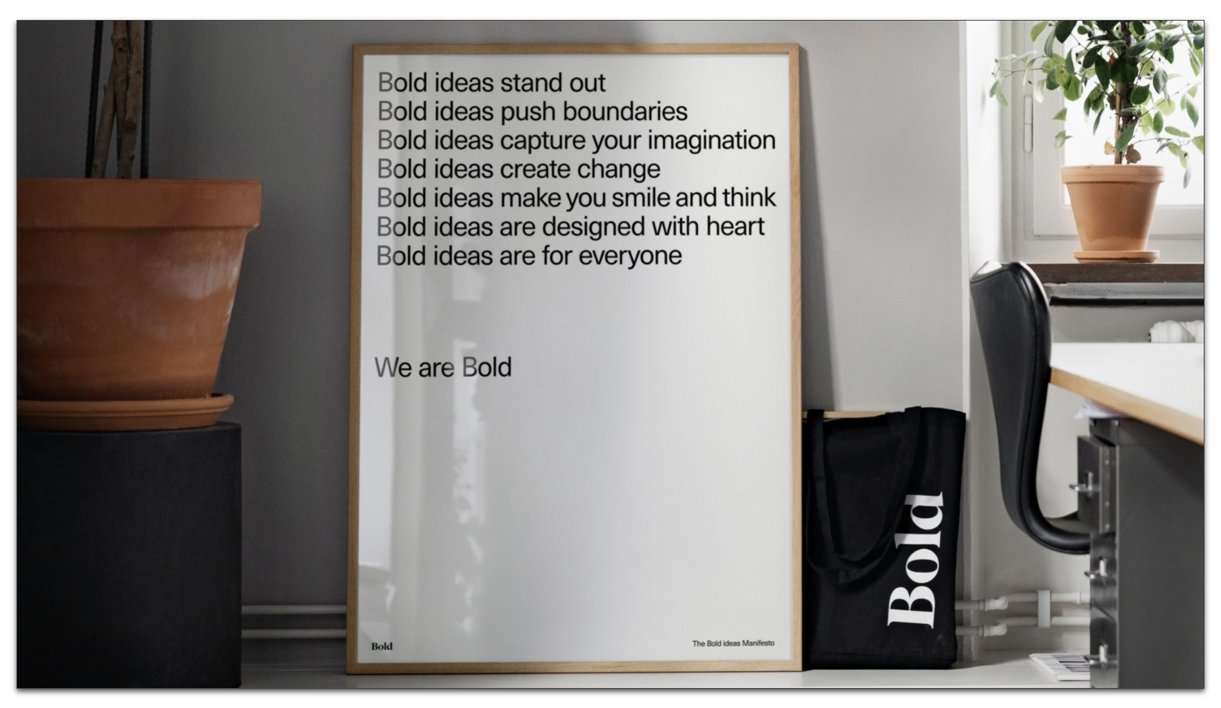
Case-in-point:
Ask yourself if the design below actually communicates, or if it merely assembles some words that don’t actually connect with the intent. Is it actually successful in spurring the very thoughts and actions that those words describe, or does the design run counter to its purpose?
Agency of Record.
The term implies a relationship where an agency agrees to make recommendations on an ongoing basis, in order to solve a client’s marketing problems.
Quite often, however, such a relationship devolves into diplomacy and the mere maintenance of cordial relations. It’s like everything that requires effort or pushback is a sensitive thing, as if people owning the relationship on the agency side are walking on eggshells – afraid to speak up, and make firm suggestions or demands.
I truly don’t understand why so many agencies choose to be so subservient all the time; turning into passive-aggressive order takers with near-inevitability, instead of trying to be trusted advisors.
A truly meaningful client-agency relationship requires trust, and a willingness to collectively put your finger on the problems that are hindering the client from achieving optimal results.
I’ve never known a client who accepted if the rationale for a bad solution was simply “Well, you asked for it!”. Clients expect their agency partners to both know better and do better, making appropriate recommendations. Often, this seems to go to the genesis and DNA of every business – if you’re working for a company founded by bean counters, then nothing but beans is of value. And there is little realization that beans actually need to be planted first, in order to yield results.
(Also, you know the old rhyme: ”beans, beans, the musical fruit. The more you eat, the more you toot.” If we see beans as a metaphor for cost and ”toots” being the output, those are perhaps not really the results that clients want…)
To be more specific, what perplexes me is that some agencies can’t seem to get it in their heads that subject matter expertise is something you CAN and SHOULD sell to the client, because (drumroll): clients actually LIKE that kind of stuff. And it might make them respect you, and listen when you advise them.
It’s true that there’s a time and place for everything – which is exactly why agencies need strategic orchestration of all client accounts, and figure out at the OUTSET if a project needs discovery, strategy and solutioning. If not, the work is just BAU, and all we need to do is to focus on requirements, cranking out assets as efficiently as possible. But instead, agencies tend to try and sell everything as BAU, packaging every service up into easily quantifiable and sold set of off-the-shelf solutions.
Which seems to be exactly why consultancies are eating agencies’ lunches right now. Consultancies promise solutions and outcomes, and proceed to deliver them by iterating on client needs, as opposed to the agency approach of bucketing everything into piecemeal one-size-fits-all units that are sold with a fervor of a street market vendor.
”Display ads! Display ads” Special price, only for you my friend!”
Even if what the client actually needs isn’t display ads.
To quote Maslow: “To the man who only has a hammer, everything he encounters begins to look like a nail.”
So, how do agencies dig themselves out of this siloed, homogenized, mass-marketing-slash-carpet-bombing paradigm, where clients are quantified and not qualified, and adapted to existing solutions instead of the reverse? Where consumers are treated as faceless masses of undifferentiated people, with the same generic needs?
I sadly think we (as marketing practitioners, whose SME is often not respected) can only hope to achieve fractions of that goal – by focusing on things that are within our control.
And then we can maybe find approaches that could be SEEDS of broader solutions, but which we don’t fully control, and we therefore have to settle for simply spreading in the wind, like dandelions.
Only question is: who has the patience to see if all those things actually germinate into something?
If you were rewarded for that patience, then maybe… but as it is, with the somewhat neurotic over-emphasis on agency-client relations as opposed to tangible results, it all has to be skunkworks in nature, without any promise of results OR reward.
This, then, is the AOR Dilemma.
