
Category: Uncategorized

Brand Consistency
Agreement
In order to even speak about brand consistency, and reach meaningful and actionable results, we must first come to an agreement about what this means, and how we address it.
Without such an agreement, any talk about the brand becomes rooted only in the subjective perceptions of individuals. Everyone can have an individual opinion about a brand, but a brand is first and foremost a collective thing, meant to represent a company consisting of many different stakeholders. These must all be in agreement about what the brand is, or at the very least how to talk about it.
Rules vs. Opinions
In order to reach an agreement about anything, we must have rules upon which such an agreement can be founded: what it is that we are trying to agree on, and what the scope of the agreement is. Without such rules, every discussion about the brand will be based on the perceptions and opinions of each individual, and there are no principles around which an agreement(or even a compromise) can be collectively reached. For instance, the brand does not need to reflect every single facet of the world – there are some areas that will be more important than others to define the brand. These areas need to be part of the overall brand strategy, and should be construed as contextual rules.
For instance:
- The company is engaged in a specific industry, so an appropriate rule could be that the brand reflects this industry in some respect. This can be articulated as a rule.
- The company is centered around producing business results for its stakeholders, so the brand can be defined to convey this as well. This can be articulated as a rule.
- The brand needs to be meaningful to a certain target audience. This can be articulated as a rule.
With the guidance of rules such as these, it is easier to steer the conversation towards meaningful outcomes. It does not matter if someone has a subjective preference for a certain color, for instance, if color in general, or that particular color, is not deemed meaningful in the context of the established rules. I.e. is a certain color more meaningful to the target audience than others? If not, then such a preference falls outside of the rules. Remember, we are trying to reach an agreement, and agreements between a multitude of people based on purely subjective things are virtually impossible. This is the reason why we first need to agree on the rules.
Implementation
In addition, brand stakeholders need to come to an agreement about the rules for how the brand is implemented.
For instance:
- The brand needs to be given a visual identity. This can be articulated as a rule. (In fact, the visual identity is in itself a set of rules.)
- The visual identity is not useful to convey any of the things suggested above unless it is clearly recognizable, from one instance to the next. This can be articulated as a rule.
- For the brand to be recognizable, the visual identity has to stay consistent, or its recognizability is null and void. This can be articulated as a rule.
- For the brand to be applicable where needed, it needs to be given a usable form, i.e. produced as assets that can be replicated and applied in the relevant media, to ensure the recognizability and consistency described above. This can be articulated as a rule.
Exceptions
Any deviation from these rules, if agreed upon, must be framed as an exception, or the rules are not meaningful, and will become difficult to apply. Such exceptions should be kept to a minimum, and be justified in clearly articulated terms, or the effectiveness and clarity of the rules will deteriorate over time.
Elements of design
In order to have productive discussions with clear outcomes about rules such as these, as they pertain to design , we must define tangible aspects of design to which these rules can be applied, in a tactical sense. Otherwise, it will be impossible to frame the rules in the practical context of the design. For instance, a question might arise during the discussion about the visual expression of the brand: “What about the design does not say ’business results’ to you?”. Or: “What element of the brand’s expression needs to change for it to speak more compellingly to the intended audience?”. If the response to such questions is not specific enough, designers will not be able to address the concern; the direction will be much too vague, and results will be unpredictable.
For that reason, the design needs to be broken down into components that can be assessed separately, for instance:
- The wordmark and the symbol (if one exists), i.e. the logotype
- The typeface
- The colors
- The shapes
- The images (if any exist)
- The decor elements (if any exist)
- The composition and placement
We can assign more granular rules to each one of these design components, to be more specific and targeted in the modification of our designs. This ensures that it is clearer and easier for designers to preserve consistency, and produce designs that reliably visualize the brand in a recognizable fashion. It also means that critique can be applied with greater precision. For instance, rules can define: the proportions and placement of the logotype vs. the rest of a design; the application of type; the use of colors; what shapes are considered “on brand”; what role decor elements might play in the design; what types of compositions are allowing the brand to be consistently represented visually. Etc, etc. In general, the more exceptions to these rules that are allowed, the less consistent the visual identity will be.
Scalability
Without such rules, and without rules applied to tangible aspects of the design, execution comes down solely to the judgment and aesthetic sensibilities of individual designers. It can be very difficult to have multiple designers coalesce around specific design aesthetics if no overarching, guiding rules exist. Variations willarise. In such cases, it is almost inevitable that the execution of one individual designer becomes dominant, as a recognizable, preferred “look-and-feel”. This does not offer scalability, but produces an inevitable bottleneck, and it also does not produce the requisite clarity for the rest of the organization. The visual interpretation becomes the domain of a single individual, which is not meaningful, and poses a more challenging path for other designers to follow. A brand’s visual expression must be “democratized” and socialized, so that every person knows how to interpret and apply it, or brand erosion is inevitable. It is especially important that such rules are internalized by designers, who in essence are training the rest of the organization on the use of the visual identity, through the practice of their craft, and the consistent application of the agreed-upon rules.
Decisionmaking
In this perspective (and many others), leadership decisionmaking is key. If decisions appear to give room for too much subjectivity, and produce a lack of requisite clarity and consistency, this will create uncertainty around how to manage the brand, and result in cascading deviations from the intended brand perception.
Evaluating Creative Performance
1. What are the conditions for Creative work?
Are expectations reasonable? If we expect the highest level of performance for work that is by its nature to a large degree based on talent, are we truly securing the best talent to back up this expectation? Is the talent commensurate with what we are paying, and vice versa?
Is there creative management of resources, to ensure that the most suitable creative is assigned to each task? Creative is a much too wide a field, with too many disciplines, to be able to expect the same result from any and all creatives. Talents and capabilities vary greatly across the entire gamut.
Is there proper Estimation of the work involved, a proper Creative Brief, and a robust subsequent QA process? If not, then on what grounds are we setting creative expectations, and conducting evaluations? Without at least a Creative Brief, all expectations are inherently suspect, prone to second-guessing, and evaluations more difficult to take at face value.
Are creatives allowed to focus on their work, or are they pulled in other directions that may affect results?
2. How well is the Creative process understood?
The creative process is very rarely linear, like other tasks based on the scientific process. It is by its very nature iterative and zig-zagging, requires more “back-and-forth”, and needs more calibration based on continuous feedback.
Creative output very rarely has a single right answer. It needs to be judged in context, and usually not by a single individual, as that gives too much room for personal interpretation, given that creative work is not grounded in facts. All creative output has a dimension of ambiguity which requires a certain degree of tolerance.
To say that creative requires “handholding” is really just another way of saying that creative requires dialogue, which is perfectly true, and an inescapable facet of all creative work. There are always too many possible solutions to forego this dialogue.
The Creative process is inherently subjective. Lots of different viewpoints need to be accounted for, and many of those viewpoints cannot even be meaningfully synthesized, but rely on an emotional response. For that reason, Creative evaluations are much more challenging, and less accurate or cut-and-dried.
3. How is Creative work evaluated?
Is it based on tasks, goals and requirements that were properly articulated, and based on measurements of success that were properly quantified, stated and understood?
Was the evaluation subjective in any way, and/or does it rely to a larger extent on a single individual’s judgment? If yes, could this be mitigated, to ensure a broader consensus?
Ultimately, who has final say? Does this account for professional creative experience, and if not, why?
Offroading with rollerblades
Design is not random.
It happens”by design” – that is, after all, the very origin of that expression. Which means that design by definition has – or should have – a purpose, and is created for a specific reason, with a targeted outcome in mind.
This outcome depends entirely on how the assignment is framed and articulated.
So, when you tell your designer what you need the design to do, and what you say leads your designer to think that a pair of figurative rollerblades will solve your needs, that decision was made with a specific intent, and a specific use-case in mind.
If you later tell your designer that you intend to go offroading, well, then the design is clearly no longer adequate, and the time spent on it was wasted.
The designer needs to start over.
It is now clear that your wheels need to be larger, configured differently, and probably shouldn’t be strapped to your feet but use a sturdier chassis.
In design terms, this means the layout will need to be reconfigured. The typography may need to change. The colors can’t stay the same, and the imagery may need to be swapped out, requiring another time-consuming image search.
The question is: if you knew in advance that your intent was to figuratively go offroading, should you not have told your designer so?
Because the outcome would have been entirely different.
Scale to fail
It appears that the future of advertising now hinges on the faulty conclusion that if only 0.01% of ad exposures produce the desired outcome, then we must scale advertising using A.I. so that people are exposed to 10 000 ads for each successful outcome.
Obviously, this relies entirely on a calculation of efficiency as opposed to effectiveness. We seem to have given up on making ads more effective, and instead accept the fact that ads are now so ineffective, the only way to counteract it is by spamming people, at scale.
Does noone in advertising ever stop to think that this is really nothing but a race to the bottom, and will only serve to make advertising progressively less and less effective? Forcing advertisers to spam people more and more? Cluttering up more and more channels and spaces with less and less productive ads? Email as a channel has already been severely compromised due to spam. Social media is quickly going the same way, with users constantly complaining that their feed is taken up by more and more ads and promoted posts with tenuous relevance to them.
Advertising needs to be relevant and authentic for people to give it any of their time. Our bullshit detectors have gotten so refined that we now tune out ads without even thinking about it. When people feel like they are being manipulated into constantly looking at ads instead of whatever they’d rather be looking at, we’re left with ad fatigue, and people turning their eyes away.
We need LESS advertising for advertising to be effective, not MORE of it, and we also need the ads to be more tailored and curated.
A.I. is not the way out of this. Authenticity and relevance to human beings will never be produced by a machine. The machine might be able to judge the likelihood of such relevance, but in order for the machine to replicate that relevance, it by definition has to serve a copious amount of irrelevant ads in order to learn. More ads will never make people more receptive to advertising. It will only leave people feeling starved of meaning and context, which will turn them more and more apathetic.
Advertising at scale, then, is a recipe for apathy.
Shame on you, H.R.!
I struggle mightily with understanding why H.R. is so willingly making itself an enabler of generative A.I., specifically in the hiring of creatives, and in the displacement and replacement of creative talent.
At best, it is inconsistent and self-defeating. At worst, it is deeply immoral.
First, you put up requirements for creatives to showcase expensive art, design or writing degrees. Then, you expect them to prove their abilities by proffering extensive examples of their work experience, and providing references to back it up. Lastly, you expect to be served examples of creative work, which will presumably be judged (subjectively, but hopefully by people who are qualified to make that judgment), based on its inherent qualities. Then, at the very end, you expect them to replace all of that knowledge, all of that expertise, all of those evident qualities, with homogenized and industrialized machine output, reducing all of their varied experience to prompt writing. Why on Earth would anyone take on a mountain of student debt to learn a trade, taking pride in the quality of their work, using that pride to further the objectives of their employer, only to have their work be reduced to data entry, thereby becoming complicit in the complete erosion of their entire profession, and the depleted value of the skillset they’ve fought so long to attain?
There are profound problems inherent in equating generative A.I. with human expertise and human learning. Let’s be clear here: whatever A.I. tech advocates may say to the contrary, generative A.I. engines don’t actually learn in the true semantic sense of the word. They are not sentient, they are not able to draw conclusions and weigh them against each other, or extrapolate from what they see. There is no lateral thinking whatsoever. There is no trial-and-error, no judicious application of the many considerations going into the appropriateness and “feel” of creative work. There is no social context for the use of the output of generative A.I. These machines are trained to identify patterns, replicate them, and fuse together replicated pieces, like a high-tech meat grinder. This is a BIG difference compared to how humans work, how actual learning works, and how creativity works.
More importantly, that replication is fraught with legal, commercial and moral problems. Some examples:
TRUE LEARNING VS. REPLICATING
A human artist who learns from another artist would probably initially copy the other artist’s work, but eventually transcend those influences, and emerge with a style more their own. With generative A.I., sure, you can feed the machine examples of an artist’s work, but it doesn’t become that artist by ingesting those pieces of visual data, and it never develops aesthetic sensibilities of its own. All the A.I. learns how to do is to imitate that style, which is lightyears away from the organic inspiration and learning that happens between human artists. Moreover, the output is judged by how precisely the A.I. approximates someone else’s work, whereas a human artist is typically judged based on the uniqueness of their output. If a human artist simply replicated the work of another artist, there is a word for that: it is called counterfeiting. The counterfeiter could (and would!) be sued and be taken to court. Surely, you wouldn’t expect a company like Disney, for instance, to accept the wholesale, industrial scale duplication of artistic work they’ve spent generations refining, would you?
UNIQUE VS. COPYCAT
Then we have the field of branding and corporate identity, which would suffer immensely from the uncritical adoption of generative A.I. First of all, anything incorporated into a brand’s visual or verbal presence that has been created from replicated pieces of other creative output is obviously not unique, it goes without saying. Hence, it flies in the face of the very nature of brand building. Its value in defining a distinct identity, or catching the attention of potential customers by standing out, is inherently compromised. Second, what is not unique cannot be owned or claimed as your own: others can freely copy it, and the coherence and recognizability of a brand would suffer immensely from it. Commercially, this would devalue the brand, far more than any savings possible from using A.I.
DEVELOPING VS. vs. STEALING
There are ways of creatively developing new, improved forms of output without directly replicating something already existing, and that process is not new: it’s called R&D. The perennial truth in that field is that there are no shortcuts. If a car manufacturer wanted to develop a sportier car, they wouldn’t steal a racecar, take it apart, replicate its patented componentry, and implement it as-is. Instead, they would analyze the racecar, understand how it worked, and then apply whatever mechanical and aerodynamical principles that were observable and applicable to their product, and then iterate and test it until they found a workable set of components that produced the intended result, and were feasible to produce in an economical way. Part of that testing would involve how it felt to drive the car, a sensation that any A.I. would struggle to account for in its output. Moreover, the cheating involved in simply replicating existing components would be considered a crime; one for which the manufacturer would be taken to court and punished by the letter of the law. There’s an entire legal profession dedicated to this, and you better believe they are gearing up to incorporate the defense against abuse of A.I. into their law practices.
GROWTH VS. ATROPHY
If you, as an H.R. professional, think that you are contributing to growing the competence of your creative department by hiring people with a focus on generative A.I. usage, you have an extremely short-sighted perspective. Do you seriously think, for instance, that the creative ability to envision and visualize bespoke solutions won’t be affected if you have people do nothing but sit and feed prompts to a machine, and judge what of its output is usable…? That removing creative immersion in artistic decisionmaking will not lead to the atrophy of creative abilities in your staff…? Imagine if you had your Art Directors do nothing but conduct Google image searches all day, being fed algorithm-homogenized images for years, recycling the same visuals in a giant aesthetic echo chamber. Do you think they would ever come up with anything eye-opening or truly creative ever again? We’ve already seen the effects of algorithm-based selection of content in the increasingly isolated thought bubbles of social media: it leads to an erosion in human contact, and a depletion of human ingenuity. Instead of coming up with sentiments that more truthfully and genuinely represent people’s opinions and feelings, we are reduced to sharing and recycling memes, and using pre-defined emojis. Imagine applying that same homogenizing effect to the entire field of creative work! If that doesn’t give you pause, you seriously haven’t given it enough thought.
CONVINCING VS. CONNING
The entire field of marketing is based on the principles of persuasion: that advertising can somehow convince a potential customer to change their purchasing decision in your favor. This has, so far, been entirely dependent on human-to-human communication, as it should be. Meaning, if you are being persuaded, it was ultimately another human being who persuaded you. If they did so through illegitimate means – by exaggerating, obfuscating, lying, swindling – then that is something for which a human can be held accountable. In the case of machine marketing output, what does that accountability look like? Nobody knows, and it will take decades of legal wrangling in court to establish enough legal precedents for the law to be consider settled. In the meantime, we will see A.I.s step over the line and repeatedly lie to people, without knowing it is doing so, without its handlers knowing it did so, and without anyone being accountable. We’re already seeing that happen: very recently, a summer reading list with AI-generated content, including fake books and quotes, was published by several newspapers. This will lead to a deepening of already dangerous levels of untruth.
AGENCY AND RESPONSIBILITY
It is my firm belief that, at a certain level – say Director level and up – any professional should have a say in which tools are used to practice their trade, and how they are used. More than that, it should be part of their responsibilities. That is, in fact, part of what you are hiring them for, and more importantly, you should be hiring them to stand up for what is right, not to become unthinking tools of machine adoption. Denying professionals that agency, that choice, and that say in the execution of their own professional duties, is tantamount to a form of abuse – especially if it leads to the depletion and devaluing of their hard-earned capabilities, and the long-term dismantling of their own profession.
If you go into H.R. thinking that it’s your job to enable your employer’s abuse of their employees, I would suggest there is a deep flaw in your moral compass.
Shame on you.
How To
Self-help is all the rage. There are books on almost every subject known to man, and the Internet is overflowing with helpful content, trying to instruct people on how to do stuff – all kinds of stuff. There are presumably knowledgeable people lecturing and speaking at conferences about how best to do things, all sorts of things, and people are gobbling it up left and right.
I love the good intent behind this type of advice, truly, and I don’t want this to sound uncharitable, but I’ve personally had a pretty important realization over the past five-six years on this topic:
It’s not for me.
Don’t get me wrong: I used to LOVE this kind of “how-to” content. I read it voraciously, and I think I believed that it would make me productive; that it would clarify things for me; that it would empower me. I read loads of interviews with other creators, and clung to their words as if they were magic formulas. I thought that by absorbing their methods, and using their tools, I could emulate their successes.
But I’ve found that it actually does the opposite. For me. By focusing so much on how other people do things, and by trying desperately to internalize that, I lost sight of how I do things myself. I’ve lost sight of the fact that I actually do know how to do stuff. I have the capacity to work through things, and figure them out for myself.
And after realizing this, I’ve become many many times more productive – so much so that it’s actually astonished me. I’ve been more productive in the past five years than I had been through the entirety of my career up to that point. It’s made me a bit regretful of the time I wasted; all the time I sat there procrastinating, thinking I needed to read up on something before I went ahead and did it.
I’ve done some soul searching to figure this out, and the answer – while not exactly revolutionary – still hit me like an epiphany. I think that I (and many others) learn principally by doing – not by reading, hearing, or observing. And while I was trying to learn how to do stuff in those other ways, I actually wasn’t learning, and it made me feel that I couldn’t do whatever it was that I was trying to do. But by not relying on those crutches, and by instead immersing myself in the work, and trying to figure things out for myself to find my own solutions, it’s really uncorked my productivity.
So, for all the people out there who are helped by this type of helpful “how to” content: more power to you. But please also consider that you may actually be able to figure things out for yourself, and this may be a way of learning that could actually feel much more empowering for you. It could rid you of crutches, of methods which may ultimately not be for you, but which will hold you back as you struggle to make sense of them.
Sometimes, the right way to do something is what works for YOU, not what works for others.
Now I guess I need to go write a self-help book on the subject. Let’s see, how do you write self-help books…?
I’d better Google that.
(Reposted)
A.I. and You
I’m sorry but if you confess to me that you rely extensively on A.I. in your professional work, I am always going to have a slice of doubt about your actual, operative competence.
It is not that I would question the work itself necessarily, but the reliance on A.I. suggests that you’re perhaps a bit too comfortable with taking shortcuts.
The lack of immersion suggests that you’ve not subjected yourself personally to the many considerations that go into making strategic decisions.
Being presented with a solution and perhaps modifying it slightly is not the same as structuring your thoughts and arriving at informed conclusions through empirical analysis.
On Logo Redesign
Pardon me while I nerd out for a minute here… I have heaps of respect for House Industries, and their recent refinement of the iffy Sandals logo just cements that. They have respected the heritage of the logo while refining and improving it typographically in so many places, the craftsmanship is a joy to behold. I know to most people, this doesn’t look like much, but trust me – it’s one on the most difficult things to do, to preserve the recognizability or a logotype while still refining it and adding a new level of quality to it. Hat’s off to Ken Barber.
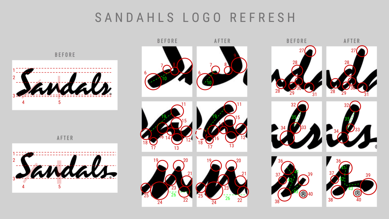
I count 43 distinct differences, and I’m not even being terribly nitpicky…
Whitewashing A.I.
Lately, I have been seeing a lot of A.I. companies trying to put supposedly “ethical” frameworks in place, in an apparent attempt to make their services ethically compliant.
In some cases, this looks like a genuine effort to at least seek the approval of the artists whose work is fed to the machine in order to “train” it. But in other cases, it looks like cynical whitewashing, by slapping a legal disclaimer and then still allowing anyone to upload the work of others, as long as they pretend to not have stolen it. We´ve seen this before, in illegal file sharing. Wink wink, nudge nudge, this work is “not” someone else´s, and I “promise” I have the “right” to distribute it.
We can expect to see many many ways in which the tech industry is going to try to circumvent the ethical dilemma at the heart of this, but regardless of the authenticity and sincerity behind those attempts, one thing they simply cannot avoid is the fact that generative A.I. output is replacing human counterparts.
While that may be acceptable if we are talking about menial tasks like street cleaning, or outer space mining, it is emphatically not okay when it purports to remove humans from profoundly human endeavors like art, or literature, or music. Nothing good will come out of replacing humans in that context. I don´t care if you wish to make a qualitative argument, that only a select few artists are worth respecting, and that the others somehow deserve to have the rug pulled out from under them in this way. (Yes, I have heard that argument made many many times: “why should art be sacred?”)
We can find productive uses of machines in many different aspects of society and human life, but replacing artists and poets is simply just a monstrous, inhumane proposition. Why would we refer to the arts as “the Humanities”, if this wasn´t about humanity and humanism as a whole…?
Trying to undermine humanism, depleting the intellectual capital and artistic abilities which make us human, is not an effort we should ever accept as a species.
Theft is not ”democratization”
Former football quarterback Colin Kaepernick has raised $4M for a business venture aiming to “revolutionize comic book book creation and publishing” by using AI. The backers of this industrialized theft of the life’s work of creative professionals refer to this scam as an attempt to ”democratize storytelling”.
The whole notion that this is somehow driven by a desire to “democratize” anything is mindbogglingly, infuriatingly stupid.
Did John Dillinger “democratize” money…?
No, what this really is, is a blatant attempt to make money by replicating the work of thousands of artists who stand to gain nothing, and whose many years of talent and hard work is now being ripped off in an industrialized fashion.
All this does is vulgarize and cheapen art, by mass-replicating it without ANY of the human talent that makes the art truly unique and worthwhile. It will allow lazy people to populate their mediocre ideas with the modern equivalent of clip art, and Kaepernick and his investor robber barons are outrageously trying to sell this as ”democratization”, even having the audacity to call the output of their AI tool ”authentic” and ”equitable”.
To use an analogy that Kaepernick might understand: it’s as if Boston Dynamics created a quarterback robot, programmed its movements using motion captures of Kaepernick himself, and then pretended they had created a great, talented athlete who should have the right to take the place of its human counterparts.
Hey, they would be ”democratizing” football, right?
