
On Logo Redesign
Pardon me while I nerd out for a minute here… I have heaps of respect for House Industries, and their recent refinement of the iffy Sandals logo just cements that. They have respected the heritage of the logo while refining and improving it typographically in so many places, the craftsmanship is a joy to behold. I know to most people, this doesn’t look like much, but trust me – it’s one on the most difficult things to do, to preserve the recognizability or a logotype while still refining it and adding a new level of quality to it. Hat’s off to Ken Barber.
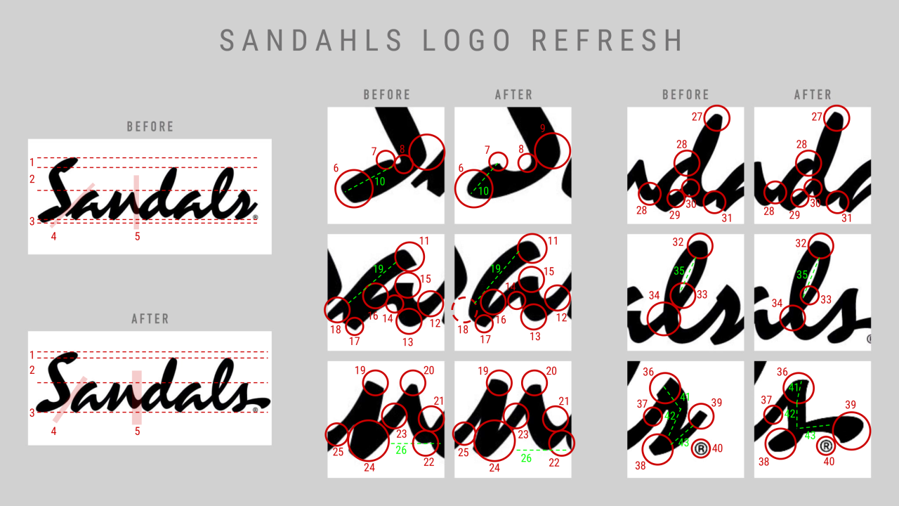
I count 43 distinct differences, and I’m not even being terribly nitpicky…
